There aren’t many things in mobile app development that are more intimidating than watching your hard-earned users leave your app. It’s like a first date that went bad. You tried so hard to make a good first impression. You waited for the exact match. And here you are, sitting all alone asking yourself what went wrong.
The hard truth is that they just aren’t that into your app.
It’s not them, it’s the app. You can spend a lot on user acquisition and retention marketing and get poor results over and over until you realize that the app is the problem.
App agency Comboapp has been consulting developers from the very beginning of the mobile app industry and too often seen that app owners forget to define the main point from the start. There is a short, simple, yet very crucial question you should answer before launching an app:
Does Your App Serve a Well-Defined Purpose?
Marketing won’t help if the product fails. If you keep losing users and you don’t know the reason, it’s time to take a step back and re-charge your product strategy. Comboapp gathered all of the dos and don’ts for app developers who had their app abandoned by users.
First, let’s talk about the dos.
Back to the Basics: Market Research
App developers often get so excited with the idea of a unique product they are building that they totally neglect the necessity of good old market research. However, it can help reveal mistakes in app development and promotion. We suggest using analytic tools from TUNE Marketing Console and Priori Data.
Here’s what you should pay attention to:
- App Store Category
Have you chosen the best category for your app? Are there alternative categories with lower competition and higher revenues?
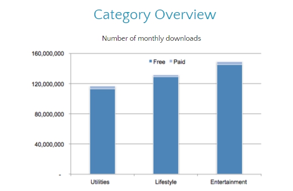
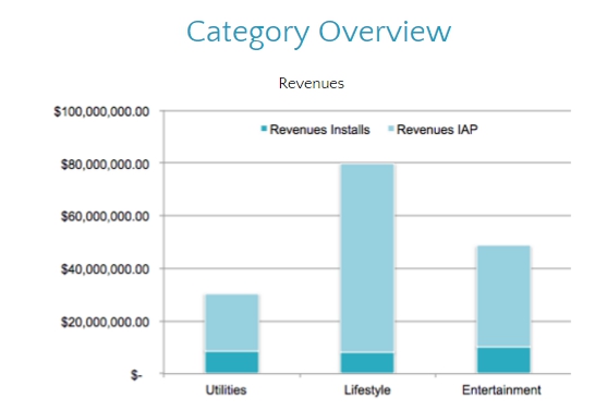
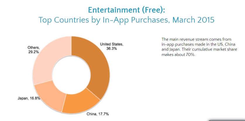
For example, an app that offers personalized lock screens—we’ll name the app Lock Screen—falls under the utilities, entertainment, and lifestyle categories. Each category has a different number of apps, app downloads, percentage of paid apps and top-performing countries, where the most part of in-app purchases came from. Lock Screen’s current primary category is utilities, but two other categories have a higher number of monthly downloads and revenues:
It makes the lifestyle and entertainment categories a more reasonable choice for this app (Apple allows users to choose two categories for one app, while Google permits only one).
2) App Localization
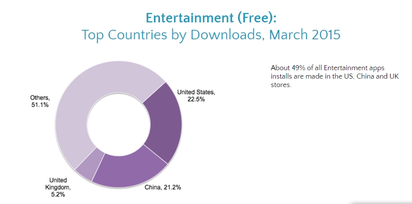
Is it worth spending time on app localization and concentrate on other countries? Take a look at top countries by downloads, in-app revenue, revenue from paid apps.
Outside the U.S., our Lock Screen app should consider China, Japan, and the UK for localization. They are leaders in both number of downloads and revenues for the selected category:
Competitor Research: Keep Your Enemies Close
What are the chances that among the 3 million mobile apps available in app stores, there won’t be any apps that offer the same functions as your app? Maybe they also have better UI and are much cheaper? In order to stay ahead of the competition, you need to know how competitors’ apps work, who they target, and what they offer. Create a list of competitors using this algorithm:
Top apps from category + App reviews in media (such as top 10 messenger apps) + App store search with keywords
Here are the main details you should pay attention to:
1. Monetization model. What monetization model do competitors use? What is the average price range? Do they add banner ads to apps? By analyzing this information, you’ll be able to adjust your own monetization strategy.
2. Strengths and weaknesses of each app will help you understand what can be changed in your app. What is the app’s graphic quality and level of details? What are the main features of the app? App store reviews are a great source of straightforward users opinion on strengths and weaknesses of the app.
UX Design Review: Search for Typical Mistakes
A lot of apps with potential failures are due to a poorly-designed interface. It works as a barrier that scares off new users. Comboapp has noticed that most bad interfaces contain very typical mistakes:
- Lack of well thought-out navigation and architecture. One cannot build a house without a detailed draft, the same is true for a mobile app. Start with logic, navigation, and scenarios.
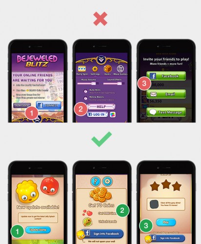
- Vague onboarding. Don’t leave the user alone with the app right after the install. Onboarding is a step-by-step process of integrating new users into the app’s functions. It is a crucial part of explaining how the app works and how users should navigate it.
- Too much design. Sometimes designers get carried away with all of those objects, color schemes, and shadows. They concentrate on creation instead of resolving tasks. Remember that the main task of a UI is to transmit the information in a simple and clear way.
- Non-intuitive design. Something that seems obvious for a designer doesn’t necessarily mean it will be obvious for a user. Stick with general associations: green color means “yes”, red color means “stop”, “+” sign means adding, etc.
• Inconsistent design. Don’t mix different styles and color schemes into one app. Consistency will make it easier for users to navigate the app.
Now, let’s talk about some things you shouldn’t do if users leave your app too fast.
Product Death Cycle: Add Yet Another Feature
Don’t ask users about missing features in your app. As Andrew Chen noted in his Next Feature Fallacy post, adding one more feature to your product won’t suddenly make people use it. It’s a mistaken belief that comes from the fact that it’s much easier to add one more feature than try to find the cause of user-engagement failure. If you are led by a user instead of having your own vision of the app, you’ll get trapped in the product death cycle: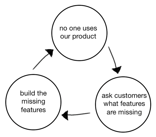
Scale User Acquisition Spend: No Need to Rush
Even if you have spare costs to spend on user acquisition, better to think twice before launching a new campaign. Precise targeting and customized media buying may help to acquire a better audience, but they won’t fix the underlying problem. If you haven’t found the reason for low retention rate, new users will leaving just like old ones.
Oh yes, we know that researching and analyzing an app’s UI design can take plenty of time and effort. That’s why agencies like Comboapp help app developers and publishers cope with such tasks. But this analysis leads to unique insight of market fit and customer expectations that help create a successful app.
Have you done market and competitor research for you app? Does this information help with app development and promotion? Share your thoughts with us in the comments.
Like this article? Sign up for our blog digest emails.
Author
Becky is the Senior Content Marketing Manager at TUNE. Before TUNE, she handled content strategy and marketing communications at several tech startups in the Bay Area. Becky received her bachelor's degree in English from Wake Forest University. After a decade in San Francisco and Seattle, she has returned home to Charleston, SC, where you can find her strolling through Hampton Park with her pup and enjoying the simple things in life.





Leave a Reply
You must be logged in to post a comment.