You need to win three main conversion opportunities to optimize app installs.
Ratings and reviews continue to be the top item mobile users value, but have lost their differentiation power for top apps. App descriptions are the new linchpin determining whether people install your app or pass it over for another one, and app videos are critical too.
But app developers and marketers need to consider all of the elements of their app store listings — title, icon, category, and more — at each of three critical conversion opportunities.
App Store Optimization really, really matters
It’s almost impossible to overstate the importance of each piece of data you supply to Google Play and the iOS App Store about your app. You’ve worked hard and spent significant sums to evangelize your app, build it, and market it. You’ve probably paid for some app install ads, and you’ve invested in social media marketing.
Here is where it all pays off… or where it all dies.
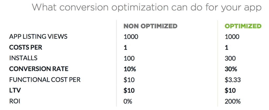
All marketing has costs, whether it’s paid installs or “free” options such as social media marketing, public relations, and blogging, which take time and effort to do well. Optimizing so that you triple your conversion rate and generate more installs with the same marketing spend can make all the difference between positive return on investment … and nothing at all.
Three chances to impress
There are three primary conversion opportunities in Google Play and the App Store. Your goal as an app marketer is to optimize conversions on each of them. The important thing to remember here is this: different elements matter more at different conversion opportunities.
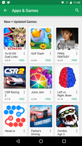 For example, your app’s name and icon are not huge factors in driving downloads from your app listing page.
But they are absolutely massive in driving conversion from the first two opportunities listed below — contextualized browse and active search — to clickthrough (or tapthrough) to your app listing.
- Contextualized browse
- What it is: Someone opens the App Store or Google Play app and starts scrolling. Your app icon, category, and name show up in curated lists like “Games Starter Kit” or “Get Your Tickets” or “Top Free.”
- Key assets: App icon, name, and category
- Active search
- What it is: Someone searches for a particular name or keyword. Your app shows up in the list of results.
- Key assets: Different for each platform, but the common ones are name, icon, and category. The App Store adds two partial screenshots or one landscape video; Google Play adds a star rating. (More details in the full report.)
- App listing
- What it is: Someone follows a link in or out of the app store and lands on your full app listing.
- Key assets: The full enchilada. See report for full details.
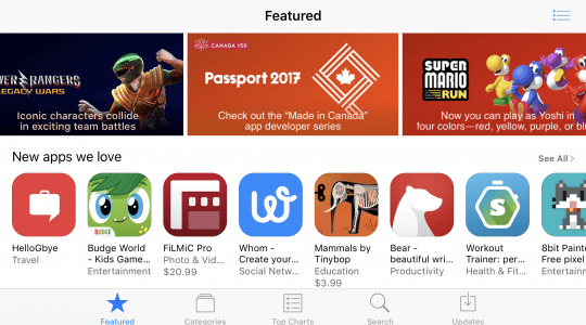
Other conversion opportunities include featured listings, when Google or Apple features your apps, and leaderboard listings. Typically listing formats in these, however, are not terribly different than search results.
Understanding user motivation
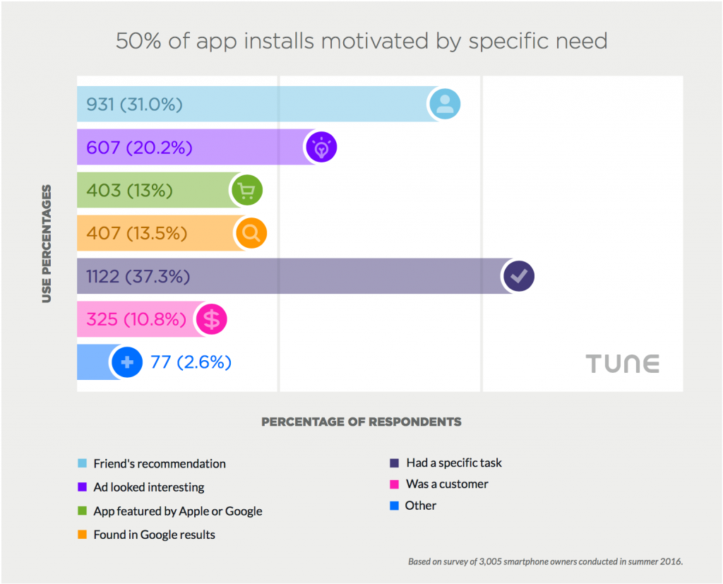
As we’ve talked about before, the single biggest driver of app installs is task accomplishment. (If you think that sounds too business-like, remember that finding a game to waste 20 minutes with while waiting for the bus is also a task.)
People want to get stuff done. What does that mean?
It means your app install prospects are going to be in a hurry, are going to be scanning for details and images that will jump off the screen — not reading carefully. Essentially, they’re hunting for the data that matters most.
But there are some interesting differences when you tease the numbers apart by age, sex, and platform.
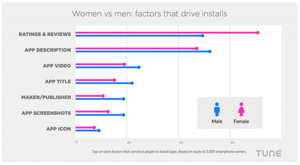
For instance, women disproportionately care about ratings and reviews, while men care just slightly more about everything else — particularly app videos and app screenshots — suggesting that women might care more about social proof, and men might be more visual.
(For more data on differences, get the full free report.)
Let’s start at the top: name and icon
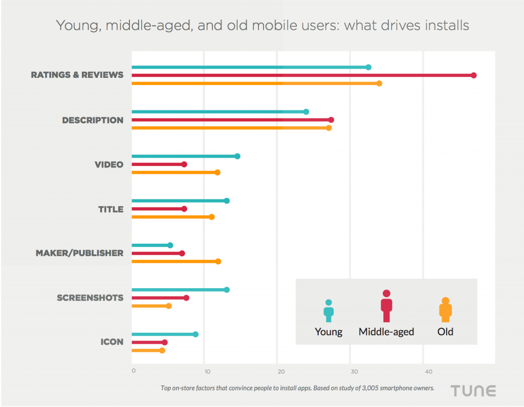
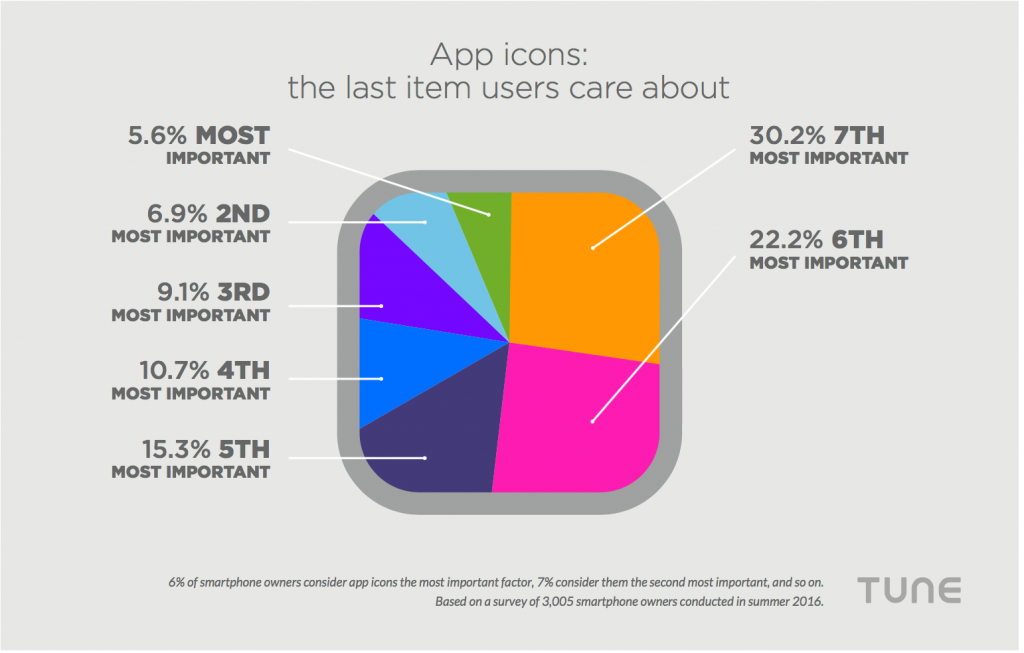
App names are icons are not super-important in terms of winning the install … or are they? 3,000 smartphone owners ranked app icons last when we asked them how they make install decisions:
But it’s important to not just think about the name or title in reference to every other element your app listing has, but in reference to when and where people will see it. And they’re most likely to encounter it early in the funnel.
In fact, in the first two conversion opportunities — contextualized search and active browse — they are the primary focus and there’s not much else to look at. At those stages, the goal is simply encouraging mobile users to keep going deeper into the funnel, to the app listing, where an install decision is most likely.
Your app icon and your app name won’t cause an install … but they can cause plenty of top-funnel conversion failures.
Ratings & reviews are table stakes
Clearly, ratings and reviews are tremendously important.
 Also clearly, you’re going to have put in a significant amount of effort into generating more ratings and reviews for your app in order to rank in the top hundred or so in your category. (For more on how the top apps accomplish that, please see the free TUNE report: How App Ratings and Reviews Impact Rank on Google Play and the App Store.)
But there is a caveat here…
Good ratings, good reviews, and large quantities of both are necessary for good ranking in Google Play and the App Store, but entirely insufficient. There are many factors that play into how Google and Apple rank apps. In just the same way, ratings also help incite installs, but unfortunately, fail to differentiate you from other apps.
Why?
Because they’re table stakes: all the top apps have high ratings. For example, here are the ratings on all of the iOS apps that rank from 1 to 150 in their categories (which is why we’ve concluding, in the title of the graphic, that app descriptions are critical — more on that later.)
Android is a little different, but not much.
The upshot: you generally need good ratings for people to consider downloading your app. The problem is that once you get into the higher echelons of the big app stores, all your competition has good ratings as well, which means your great ratings get you through the front door, but don’t differentiate you very much past that.
So you’re going to need more than just good ratings.
App descriptions convert
Ratings and reviews are the first hurdle to navigate to get your foot in the door. Descriptions are the second, and often a deciding factor.
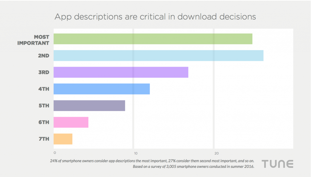
Twenty-five percent of mobile users say descriptions are the most important factor when downloading an app, and more than that rank it as second. In all, more than 70 percent of people say the app description is a top-three decider.
In addition to being a go-to place for people to see what your app actually does, good app descriptions help you rank in the App Store and Google Play, getting your app list more “at bats.” Over-emphasizing app store optimization techniques (with the goal of ranking well) when writing this will be counterproductive for conversion optimization.
Remember, people are task-oriented when installing apps.
The fastest way for them to make a decision on your app is to give them the information they want most quickly and efficiently. Just like web-based SEO, you can get your point across and optimize for crawling — you can have your cake and eat it, too. You just have to be very focused and strategic on what you’re trying to rank for.
App videos differentiate
As we’ve previously covered in detail, app videos are critical for success.
It’s simple: app videos help you rank.
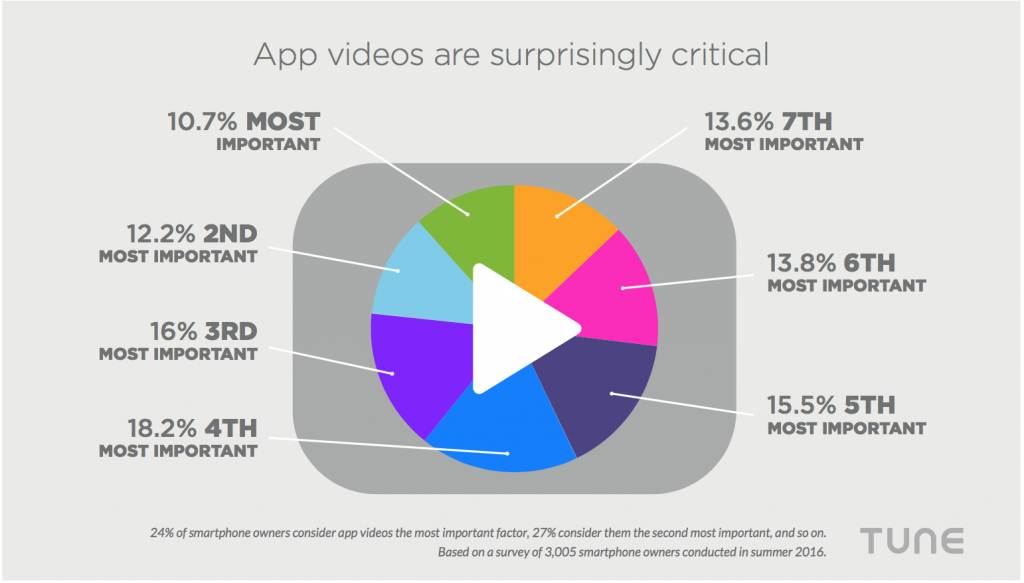
When we studied top-ranked apps in the iOS App Store, for instance, apps with videos rank higher than those that don’t. And, only 7 percent of the top apps — all the apps that rank in the top 150 in their category — actually bothered to create one.
But app videos are also a differentiating factor when people make download decisions.
While only 11% of mobile users check the video first and consider it the most important element in deciding on downloads, almost 60% rank video as a top-four consideration. And app videos are disproportionately valued by young mobile users — who often drive the early part of the mobile adoption curve — as well as older adult users.
Why?
Simple: it’s the test drive before buying the car. It’s the closest they’ll get to understanding what using your app will be like before committing to the install.
Summing it up
There’s much more detail to share, including the role of screenshots, A/B testing, and differences between genders, platforms, and ages.
For all of that, pls download our free report: How People Make Download Decisions on Google Play and the App Store.
But the key is not just what you’re optimizing.
It’s also where you’re optimizing it for in the customer experience.
Author
Before acting as a mobile economist for TUNE, John built the VB Insight research team at VentureBeat and managed teams creating software for partners like Intel and Disney. In addition, he led technical teams, built social sites and mobile apps, and consulted on mobile, social, and IoT. In 2014, he was named to Folio's top 100 of the media industry's "most innovative entrepreneurs and market shaker-uppers." John lives in British Columbia, Canada with his family, where he coaches baseball and hockey, though not at the same time.



Leave a Reply
You must be logged in to post a comment.