This is a guest blog post by Hannah Levenson from mobile analytics platform Appsee.
If you want to create a successful app in today’s ultra-competitive mobile ecosystem, you need to understand how the end user experiences mobile apps.
The user experience, or UX, is the concept of designing for ease of use by the person interacting with it, rather than designing exclusively for aesthetics. It demands a steadfast customer-first mentality — understanding and anticipating user needs with respect to the usability, performance, functionality, UI, and overall design.
There are small changes you can make to your app that can have a big impact on usability, and ultimately, improve engagement and satisfaction. Try these five tips to improving your app user experience and optimize performance.
1. Revamp Your Sign-up Screen
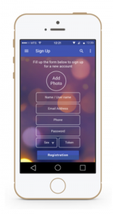
The sign-up screen is one your users’ first impressions of your app, and a bad experience can actually spark high rates of app abandonment. So you’ll want to keep it simple and easy to execute.

MetaKave’s app sign-up screen
Keep in mind that sign-up forms look a lot longer on mobile than on a desktop computer. A long form requiring non-essential information can be a turn off, not to mention that today’s mobile user has little patience and an expectation that the sign-up process be a speedy one. So only collect critical information in the form to keep it short.
You’ll also want to make the final step of confirmation a simple one. A potential user may give up on a sign-up screen if the act of confirming a profile password requires too much effort. Users want to be able to access what they need from your app with the least amount of effort possible. There are actually some great alternatives to Captcha that can help bolster your user experience and deter bots. If you are using email as a way to confirm users, make sure that the navigation from app to email is frictionless. The easier a user can navigate to their email and return to their app experience, the better chances you have of deterring abandonment.
Your sign-up screen should not be the first screen a user views. When your users are asked to sign up within the first second of their first experience with your app, you should not forget that they have not yet had a chance to explore or assess your product for themselves. You need to demonstrate the value and function of your app before asking users to make a leap to sign-up.
2. De-scarify Your In-app Permissions
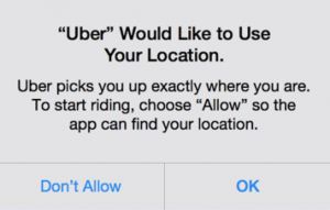
While permissions can be vital for the execution of your app’s functions, they also have the potential to scare people away if they appear invasive and/or irrelevant. Users are already apprehensive about handing over access to their personal information, location, social media accounts etc. Be sure to effectively explain each permission request and ask only when absolutely necessary.

Uber’s location permission
It is a good practice to describe why your app needs certain information, even if the reason might be seemingly obvious. We recommend asking for specific permissions after certain user actions, such as when a user clicks a “share post” button and then is prompted with a permission for access to a social media account. Users are more likely to accept this permission because it gives them a clear-cut understanding of what they are granting permissions or access to.
3. Spice Up Your Microinteractions
Every time you use an app, website — even an appliance — you have executed a microinteraction. These are simply interactions that revolve around a single use case, such as changing a setting, syncing devices, setting an alarm, picking a password, logging in, and so on.
Microinteractions have the potential to help make an app feel more human and personal. They can encourage the user to feel a connection to the brand, a connection that can ultimately improve your retention rate.
Unfortunately, because microinteractions are so minute and commonplace within the app experience, they can be overlooked during the design process. Creative design around microinteractions can be a powerful initiative to help reach and even exceed these expectations.
4. Add Controls and Transparency to Sharing Options
People have become more accepting of sharing personal information on mobile devices and within apps, but that has also increased concerns about how that information is stored, shared and used.

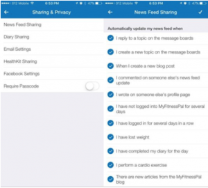
MyFitnessPal’s app offers users many privacy and sharing settings in which they are very clear about how users can tailor their settings.
To establish trust and transparency with your user, explain exactly what they are sharing and with whom they are sharing it. Do not automatically set all of the sharing settings to “allow,” which could feel like a violation of trust by a new user. It is also a good practice to remind users about their sharing settings via an in-app message.
No one wants their private content shared on social networks without their knowledge or permissions, and if that happens, you’ll not just lose trust, you’re probably also getting a negative review, which has additional downstream effects.
For example, if you have a fitness app, do not assume that users will automatically want to share their diet and exercise progress with their Facebook or LinkedIn community. Instead, make sure to provide a variety of sharing options for your users that they can switch on and off at-will.
MyFitnessPal app offers users many privacy and sharing settings. They are very clear about how users can tailor their settings.
5. Gather Qualitative Data
So you have worked really hard on your app’s design and you now want to analyze the effectiveness of your efforts. To put it simply, traditional, free analytics are not going to cut it. While quantitative data is certainly important, you must gather qualitative data in order to fully understand your UX and pinpoint opportunities for optimization.
Qualitative analytics platforms will allow you to visualize what is actually going on inside your app and how your users are reacting to certain optimization initiatives. This capability is thanks to robust visualization features such as touch heatmaps and user session recordings. Instead of having to spend hours sifting through quantitative data to try and understand why a user left your cart screen or chose not to sign-up to your app, visual data will instantly provide you with the crucial “whys” behind all your numbers.
In a Nutshell
Always be thinking about how the user will interact with different functions in your app, and design with them in mind. Optimization is an ongoing process and over time, you’ll see the value of your improvements.
Like this article? Sign up for our blog digest emails.
Author
Becky is the Senior Content Marketing Manager at TUNE. Before TUNE, she handled content strategy and marketing communications at several tech startups in the Bay Area. Becky received her bachelor's degree in English from Wake Forest University. After a decade in San Francisco and Seattle, she has returned home to Charleston, SC, where you can find her strolling through Hampton Park with her pup and enjoying the simple things in life.


Hey, Hannah
Agreed with your all points. These are some great ways to improve app user experience. I think rather than revamping login screen if we use social login to authenticate, the process of registration become more easy and quick. Because user can login to app y using their social media account. This improves user experience y saving their time and effort. What are your views on this Hannah?
If you’re designing a mobile app then user experience should be at the forefront of your creative process. Many UX principles seem like common sense but it’s surprising how many apps are incredibly confusing to learn.
This is really great.. user friendly app can boost your business. Thanks for sharing this article.