
While many marketers spend much of their time at the top of the funnel attracting new users or at the bottom of the funnel turning them into buying customers, there’s actually a lot that can be done in the middle of the funnel to make the process faster, easier, and more effective. And all those things add up to more revenue, satisfied customers, and a better performing app.
Below are five simple ways you can experiment within your app to improve middle-of-funnel KPIs.
Try these 5 middle-of-funnel app experiments
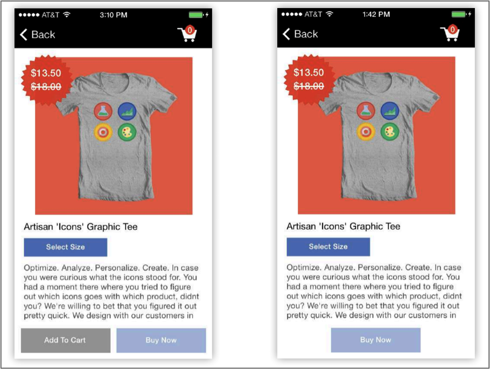
- Decrease the number of buttons to simplify purchasing
Providing a single option for action reduces decision paralysis and encourages users to convert. Choose the call-to-action (CTA) that you most want users to take; in the example below, adding to cart is a nice step, but encouraging users to buy immediately ensures they are less likely to change their mind or get distracted before completing the purchase.
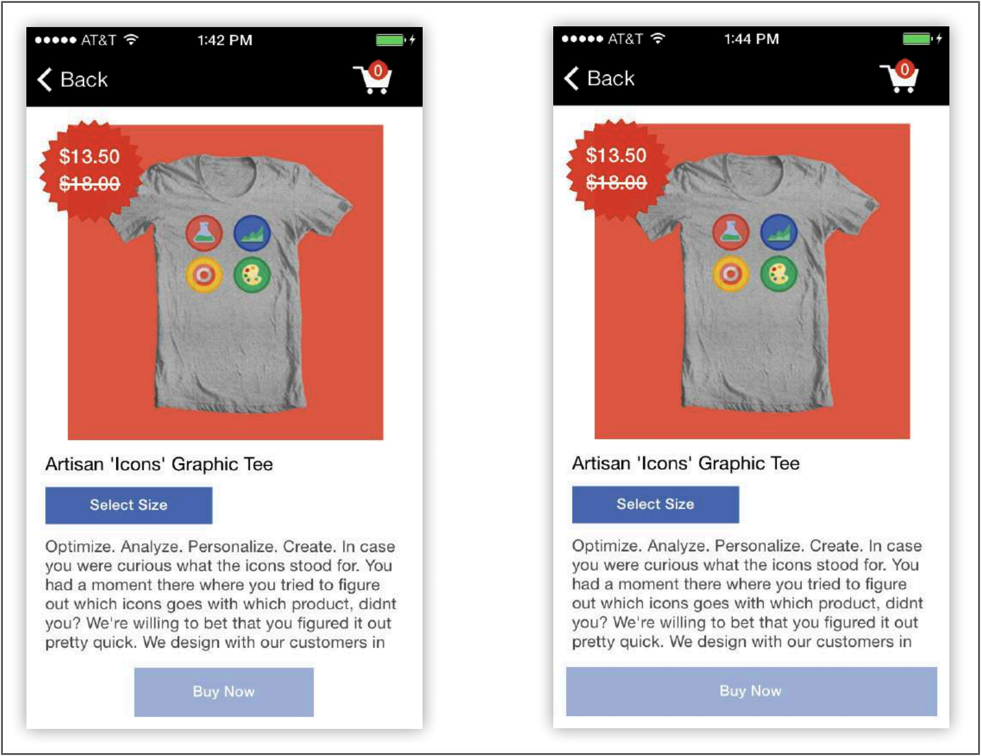
- Increase the size of buttons to simplify the purchasing process
Increasing the size of your CTA buttons makes it easier for users to interact with your site, encouraging more conversions. In the example below, the “Buy Now” button on the right is much easier to see, making it more likely that users click on it.
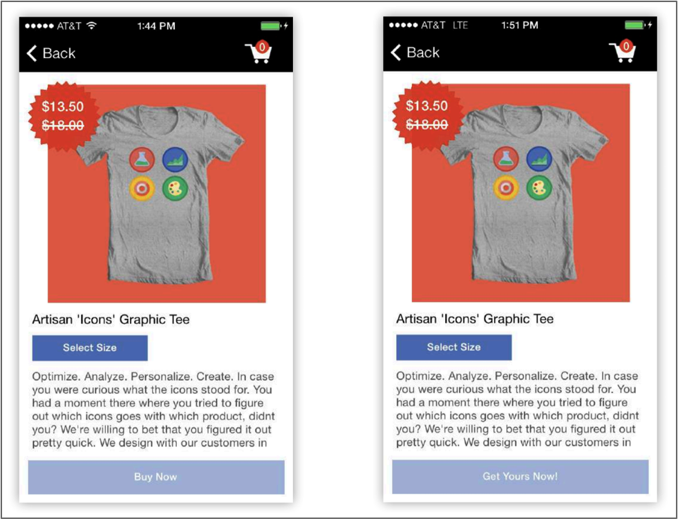
- Increase the strength of the call to action on the checkout button
Persuasive, action-oriented messaging encourages users to convert. Saying “Buy Now” is fine, but something like “Get Yours Now!” sounds conversational and implies urgency.
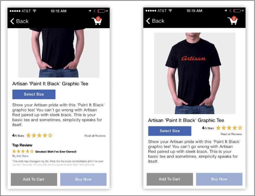
- Move star reviews above the fold
While there’s a lot of information competing for above-the-fold space, ratings and reviews are something that you definitely want to make room for. Adding social proof like star ratings and user reviews builds authority and encourages users to convert. And by adding above the fold, you’ll make sure users see it before anything else.
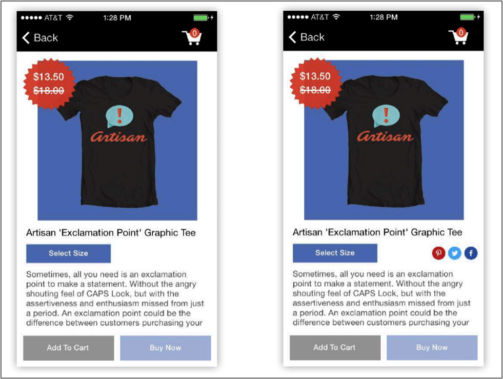
- Add social networking icons to the product detail screen to promote social sharing
Which are you more likely to share: something that requires you to login to your social networks, hand-craft a message, copy and paste a link, and move between multiple apps to share — or something that requires the click of a button? The latter feels pretty obvious, right? Adding social sharing icons encourages users to share products on social networks, and makes it easy on them to do so.
Try it for yourself
To measure whether your experiments are actually increasing conversion rates, make sure you use a solid A/B testing feature. TUNE has one as part of our In-App Marketing solution; you can even do it without bugging your developers as part of our Power Hooks feature.
To learn more, sign up for a free 30-day trial or request a demo first.
Tell us below: which one of these experiments are you going to try first, or which has worked for you before? Help your fellow app marketers out in the comments below!
Author
Becky is the Senior Content Marketing Manager at TUNE. Before TUNE, she handled content strategy and marketing communications at several tech startups in the Bay Area. Becky received her bachelor's degree in English from Wake Forest University. After a decade in San Francisco and Seattle, she has returned home to Charleston, SC, where you can find her strolling through Hampton Park with her pup and enjoying the simple things in life.


![MobileBest: Why Mobile-First Is Not Enough [Forrester Report]](https://www.tune.com/wp-content/uploads/2014/05/10271381_567497496692301_6627834864492579971_o-540x300.jpg)
Leave a Reply
You must be logged in to post a comment.