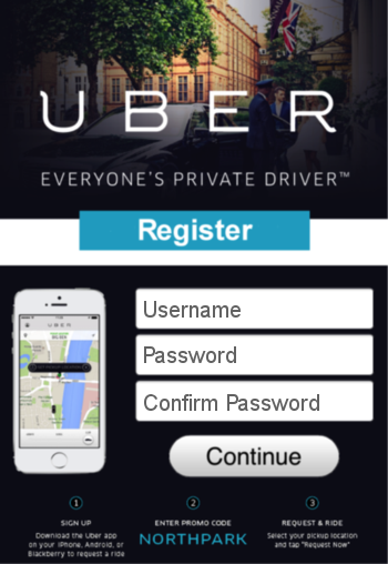
The current mobile advertising model relies almost exclusively on sending users from an ad click directly to an app store. Although there is nothing inherently wrong with this process, over time this one-dimensional approach has left many mobile marketers feeling limited — particularly when it comes to having the tools necessary to create and manage a truly customized user experience. Enter the answer: mobile landing pages.
Advertisers and publishers are increasingly looking for ways to introduce market differentiation, finding a way to provide a unique experience that sets them apart from all other app dealers, and one that makes a distinctive impression on users. The current model does not facilitate a customized user experience or provide the resources for a deeper level of engagement that goes beyond the initial ad placement. Consequently, mobile landing pages have emerged as a viable alternative to the conventional ad click-to-app store redirect.
Mobile Landing Pages
A mobile landing page is a screen that appears between the initial ad click and the app store. Introducing an extra step might be viewed by some as adding unnecessary friction, but in many cases the value of a landing page far exceeds any additional requests placed upon the user. Some of the most prominent benefits of mobile landing pages include:
Gaining full control over the user experience: With landing pages, you have full control over the design aesthetic and user experience. This gives you the chance to charm your visitors, promote your brand, entice them with a discount, or simply invite them to learn more about your company, product, or service, in ways that are not available in app stores.
Securing additional user insight: You can use the landing page to detect certain user characteristics that you might otherwise ask partners to include as parameters in the measurement URL (such as mobile OS type or browser make and version). In addition, you could include a simple form on the landing page that enables you to collect email addresses or other basic information from your visitors.
Limiting unnecessary partner interactions: If you need to update an offer, branding, or any aspect of your marketing campaign, then you can change the landing page without having to involve your partners every time you want to modify the ad or its measurement URL.
Launching your First Mobile Landing Page
When launching your first mobile landing page, start with something simple. You can always add the bells and whistles later for aesthetically-pleasing visual design, content, and perhaps greater involvement from your technical and marketing teams. Focus on purpose and function first, and minimize the parameters and requirements that you need from your partners so they’ll flock to promote your offering(s).
The following screenshot shows a hypothetical example of how a mobile landing page might look. 
As you work through the design of your landing page, consider hooking it up for attribution with MobileAppTracking™ (MAT). MAT provides accurate advertising attribution by allowing you to embed measurement URLs into page visits rather than ad clicks. This option offers a number of hidden advantages, such as eliminating the typical redirection between ad click and app store, and letting you separate any attribution complexities from your advertising partners (publishers). Accurate campaign measurement is critical to understanding your users and improving your conversion rates.
Landing Page vs. Bridge Page
While a mobile landing page works very similar to a bridge page that may appear between ad click and app store, a mobile landing page does not automatically redirect your users to an app store or automatically open the advertised app (if already installed) like a bridge does. A mobile landing page requires user interaction (such as clicking a button to Download App or Open App) whereas a bridge page automatically performs the appropriate action by detecting if the advertised app is already installed on your user’s device.
In Summary
Mobile landing pages can be an excellent way to break out of the traditional ad click-to-app store redirect model. The primary benefit of mobile landing pages is the increased autonomy over the entire user experience. With this added control, advertisers and publishers are able to promote their brands, delight visitors, and connect with users in ways that are simply not possible in the app store. When launching your first landing page, start with something basic that focuses on purpose and function. Partnering with a third-party attribution provider enables you to understand and optimize your landing page performance, which ultimately leads to higher conversion rates.
Author
Becky is the Senior Content Marketing Manager at TUNE. Before TUNE, she handled content strategy and marketing communications at several tech startups in the Bay Area. Becky received her bachelor's degree in English from Wake Forest University. After a decade in San Francisco and Seattle, she has returned home to Charleston, SC, where you can find her strolling through Hampton Park with her pup and enjoying the simple things between adventures with friends and family.


Leave a Reply
You must be logged in to post a comment.